


Mietta and Brent - on the day items
Recently I had the pleasure of working with Mietta and Brent to design their invitations and on the day items for their November nuptials. After my initial meeting with Mietta to talk about their wedding plans I knew that this was going to be something special - contemporary and elegant with a little New York style of sophistication, plus the gorgeous view of the Melbourne city skyline from their venue thrown in for good measure.
All of this is reflected in the design of their wedding stationery. The colour palette of white, grey and violet is inspired by the couples colours and the contemporary style of the event. With a simple palette, we chose to use one of my favourite textured paper stocks - Rives Design in Bright White complemented by a black and white string tie envelope to add to the contemporary look of the invitation.
To tie the whole suite together, each piece features a light violet chevron pattern inspired by the pattern to be featured on the wedding cake, and a simple emblem featuring the couples initials - which not only played a part in the decor of the event but is inspired by the M and B letters that decorate the couples home.
Below is part two of the stationery suite - the invitation set! To see part one - the invitations - visit part one of this feature here.

On the day items - table menus, order of service, place cards and table seating chart (not pictured)

Order of service - continuing the simple and elegant theme, the DL format order of service slips featured the key motifs of the set - chevron pattern and M/B emblem.
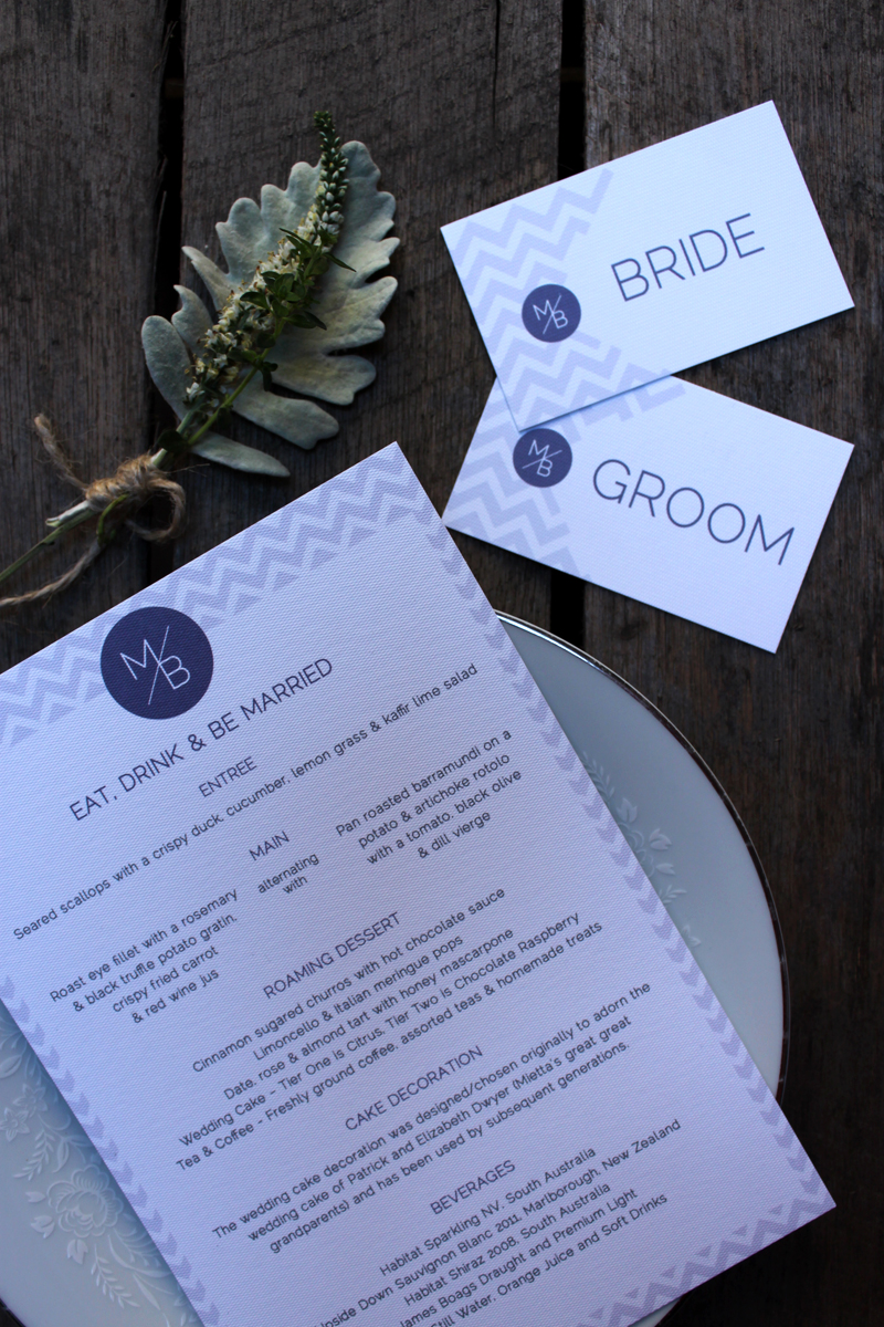
Table items - Each place seating was marked with a personalised placecard in a gilded frame. Shared menus were doubled sided - with the menu for the evening and a sweet thank you from the couple to guests.

Reverse side of the shred table menus featured a sweet thank you from the couple.