Showing posts with label CUSTOM DESIGN. Show all posts

16.7.13

New homes & fresh starts - our new website is live!

Well, this post is a little bit exciting and a little bittersweet.  After many hours of planning, coding and about 102 cups of tea - I'm excited to share the brand new TRUTH.BE.TOLD website! As you can probably guess, I'm pretty excited (and not just because all of the caffeine in those cups of tea). 
The new shiny TRUTH.BE.TOLD brings all of the creative projects and services we offer into one place. So now, you can keep up with the latest wedding stationery, illustration and TRUTH.BE.TOLD stationery product news all in one happy corner of the internet.  
You can visit the new site over at www.truthbetold.com.au. I really hope you like the new site - it has been a labour of love getting everything ready to launch, but also a lot of fun looking back at all of the old projects. 
This has all been in the works for a little while. After 5 years (can you believe it!) of posting in this little corner of the internet I felt like it was time to create a more grown up home for TRUTH.BE.TOLD to take my little creative studio into its new phase. I have loved sharing with everyone and getting to connect with so many great people through this blog.
And while I won't be posting over here about the latest from TRUTH.BE.TOLD any more you can still stay up to date with all of the fun over on the new studio blog at http://truthbetold.com.au/blog/ 
And of course, the old faithful blog will still out there in the interwebs for you to look on back through.
Thank you so much for all of your support - I hope you continue to be follow along as TRUTH.BE.TOLD grows. 
Jess x   


17.5.13

Screen printed cards - sneak peek!

It's been a little while between posts around here because I have been super busy in the studio! Here is a little sneak peek of some of the new screen printed cards I will be releasing in the next few weeks. There will be a range of fun bright colours and maybe a few neon waterfall styles too!

10.4.13

Sarah and Matt - wedding stationery


After meeting Sarah and Matt with last year for brunch to chat about their invites I knew straight away that I was going to love working with these guys. Their whole relaxed approach and orginal plans for their wedding sounded like it was going to one amazing party. Plus they were really lovely, which is always a bonus. 

Sarah and Matt had a really open brief for their invitation - they liked the idea of having a postcard, using a limited colour palette and somehow include something to do with music, venue marquees/billboards and Festival Hall - which is where they first met.  

The inspiration for the invitation evolved strongly from the musical aspects of the brief. The invitation was designed to be a ticket style allowing us to combine the invitation and the rsvp card in one piece, complete with a tear away perforation so that the rsvp could be mailed back to the couple.

The front of the invitation postcard features an illustration in the form of a venue marquee with the couples name and wedding date in a modern block type. The colour palette is a range of light to charcoal greys, which are used to create the illusion of the sign turning a corner to reinforce the idea that this is a sign on the side of a venue. The corner is also in line with the perforation which seperates the invitation and rsvp.

The reverse side reveals the invitation and rsvp. As with the front, the text is anchored on lines inspired by the marquee boards and sheets of music. The invitation and rsvp lines slant down to meet at the perforation, reflecting the turning corner on the front of the invitation. 

Both the combined invitation and the separated rsvp were non standard sizes, which gave us the opportunity to design and make 2 envelopes for the set. The invitation was paired with a light grey wallet style envelope, and the return rsvp envelope was paired with a slim charcoal wallet style envelope featuring the couples details on the same liner notes style angle as used throughout the rest of the suite.

The suite was completed by a ceremony program and thank you card, which is the same format as the rsvp card, and paired with the same slim envelope as the rsvp. 

I hope you enjoy taking a peek at the suite yourself in the pictures below.  I know I always say it, but this has been one of my favourite suites to work on - thank you to this lovely couple - especially Sarah - for being so amazing to work with! 

The complete stationery suite includes an invitation postcard with a tear away rsvp, thank you card and ceremony program.


The front of both the invitation and thank you card feature the theatre marquee with the couples names and the wedding date 'up in lights'.

The invitation and rsvp card were combined in an oversized postcard format. The rsvp was designed to tear away like a ticket, inspired by the couples love of music and the setting in which they met. The perforation was created by hand in our studio.

The separated invitation and rsvp cards

The rsvp card was paired with a hand made charcoal envelope featuring the same angled marquee linework used throughout the suite.

The rsvp card featured a space for guests to request songs for the reception, complete with a litte illustration of a record.

The invitation and rsvp card was printed on Saxton Bright White 340 GSM stock to offset the charcoal and light grey line work.


The ceremony program reflected the marquee board style used throughout the suite, this time in a DL format again on Saxton Bright White paper stock.

The thank you cards are small landscape cards, featuring the marquee illustration from the invitations on the face side and a blank reverse leaving loads of room for messages. The thank you cards are paired with the same hand made charcoal envelopes used with the rsvp cards.



9.4.13

Helen and Ben - wedding invitations

A couple of months ago I was invited by the very sweet Helen and Ben to design their invitations for their wedding in May this year. 

I love it when there is an opportunity to use illustration as a feature when designing custom wedding invitations. Helen and Ben offered my the perfect opportunity to do just that when designing their invitation.  

The lovely couple wanted an invitation with a elegant and classic black and white style, complete with a Victorian inspire pair of silhouette portraits of the couple. The couple also wanted to keep things simple and combine all of the information in one piece rather than separate invitations, rsvp, details and maps cards. 

The solution was to create a a folded 'shutter' style invitation which allowed us to feature the couples illustrated silhouettes on the facing opening panels. When opened the inside f the invitation includes the event details including rsvp, accommodation and gift registry details. On the reverse panel is a guide map for guests travelling to the wedding complete with a small horse illustration for the groom. 

The design features classic book plate style typography balanced with a clean san serif font for the details. A rounded dotted line frames each section reinforcing the Victorian inspiration for the suite. 

The colour palette is deliberately monochrome - with a dark charcoal used throughout to again reinforce the sense of elegance. The paper stock is a lovely white linen with a light texture reminiscent of that used in book covers on the Victorian period. 

Below are a few photographs of the invitation - it has fast become one of my favourites!


The feature silhouettes one the front panels of the folded invitation set the elegant them the couple plan for their wedding day. 


Inside the invitation combines the event details, rsvp, information and gift registry details - and even an instagram hashtag!


The reverse of the invitation is completed by a guide map for guests. 


The unfolded 'shutters' reveal a glimpse of the inside detail panel. 

7.4.13

Hannah and Jeff - wedding stationery

Hannah and Jeff invited me to design their wedding stationery for their upcoming nuptials in July. Now, these guys are a very sweet couple with a very Hollywood worthy 'meet cute' story of how they met - in a bar in New York, her shoe flew off - he brought it back to her and now they are in love. Can't you see like Katherine Hiegel in that rom-com? 

Anyway despite the international aspects to their story their wedding has a very Melbourne feel with the ceremony taking place at The Conservatory in the Fitzroy Gardens followed by a reception at Arc One Gallery in Flinders Lane. 

The couple wanted their invitations to be modern and reflect them as a couple. The design uses modern typefaces and a contemporary navy, mustard and burnt orange colour palette to create a young and quirky feeling. Another of the key features of the suite are the illustrated elements, including the map and architectural illustrations of the city to act as a guide for guests both local and international. 

The set which included an invitation, rsvp card and map and details card; is printed on the heavy off white stock Stephen in Spicy and complemented by a square string tie envelope and a hand made kraft rsvp envelope. 

The complete invitation suite including the invitation card, rsvp card and handmade envelope, two sided details card including illustrated map. 

Invitation detail - featuring illustrations of the ceremony and reception venues

RSVP card using the same colour palette as the invitation and small illustrated details. 

Information card - the double sided information card featured an illustrated map of the wedding locations with further details for guests on the reverse. 


The information card features illustrated elements including a tram and car for the 'getting to the ceremony' section and winter wardrobe essentials including an umbrella, jacket, comfy shoes and a scarf as the wedding is taking place in winter in Melbourne. 


Details from the map include architectural illustrations of the ceremony and wedding locations, as well as iconic surrounding locations such as Cooks Cottage. Pathways and transport stops are also marked on the maps to help guests orientate themselves. 


The map features the planned walking route the wedding guests will take to the reception venue after the ceremony, giving the guests an insight into the plans for the day. 

Claire and Nick - Wedding Stationery


Earlier this year I was invited to design a custom invitation for the lovely Claire and Nick. The suite - consisting of an invitation, rsvp, details card and map - reflects the style the couple have planned for the day - a sophisticated yet romantic feel. 


The set is tied together by the monochrome colour palette and romantic feature script and flourishes. Printed on an ivory textured card, each piece features a grey watercolour pattern on the reverse side. 


25.3.13

In the studio

March has been a whirl wind in the studio. It's been hectic with new custom designs for some very sweet couples in production, new designs and preparation for Finders Keepers Market in two weeks and a little personal project in whatever time is left (which hasn't been very much). There are literally piles of paper on every surface. And I love it! 

It's been so hectic that I haven't had time to share any sneak peeks or works in progress on the blog. So here is a quick compressed glimpse into the studio with more in depth features coming over the next 2 weeks. 


21.2.13

Learning to screen print at Harvest!


When it comes to illustration and anything creative,I love trying new techniques and learning new skills. There is one technique that I have been really wanting to learn for a long time - screen printing. I love the results you can get and the seemingly endless applications. So over the Australia Day weekend I finally got a little taste of all things screen printing when I did a 4 day course at Harvest Workroom. 

And it probably goes without saying that I LOVED it. It was a jam packed 4 days but I loved that it was fast paced, hands on and just really fun. From designing to cutting our stencils, to mixing colours and the actual printing, seeing everyone ideas come to life reminded me what I love about design. 

I'm pretty hooked on this whole screen printing business and can't wait to do some more when I do this class in April and also in my home set up. In the mean time here are a few pics of the work I did at the course. There aren't too many because I was too busy washing screens and mixing colours. 

Thanks to Emma, Jess and Lara from Harvest for the amazing class - if your are thinking about learning to screen print I highly recommend checking out their classes. 
My first stencil design - I was going for a sort of geometric mountain range look. The pic on the right is the two colour version I did on the last day - sort of a Mr Squiggle-ish two way mountain range effect. You know, upside down upside down? (Yes I am referencing a kids show, yes I am that cool)


My two colour tea towel design. I have had this idea floating around in the back of my mind for a while and finally found the perfect time to try it out. Now this took a whole lot of after class cutting to cut out the tiny homes - the teepee, caravan, house and light house - and the lettering for 'home is whenever i'm with you'. I admit I kind of got over excited with this one but hey biting off more than I chew is sort of my thing. I'm really happy with how this turned out and have plans to print some more soon!  Ps - how awesome does the stencil look up on the wash basin? 


We also learnt how to do a repeat pattern which completely did my head in until I could see it coming together while I cut the stencil. I went with a bit of a cowboys and indians design with mountains, teepees and a few arrows thrown in for good measure. I chose a deep forrest green for this and I am still really surprised at the result. I'm thinking of making a some kids clothes or cot sheets with this - all in the pipeline of course!


And this is one of my 'home is wherever I'm with you' tea towels as a two colour print. My favourite part is the little light house and boat! 


3.2.13

Mietta and Brent - wedding stationery part two

Mietta and Brent - on the day items

Recently I had the pleasure of working with Mietta and Brent to design their invitations and on the day items for their November nuptials. After my initial meeting with Mietta to talk about their wedding plans I knew that this was going to be something special - contemporary and elegant with a little New York style of sophistication, plus the gorgeous view of the Melbourne city skyline from their venue thrown in for good measure.

All of this is reflected in the design of their wedding stationery. The colour palette of white, grey and violet is inspired by the couples colours and the contemporary style of the event. With a simple palette, we chose to use one of my favourite textured paper stocks - Rives Design in Bright White complemented by a black and white string tie envelope to add to the contemporary look of the invitation.

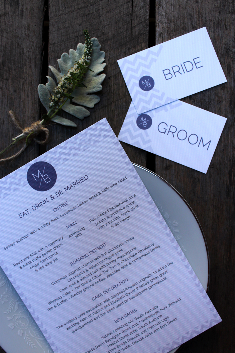
To tie the whole suite together, each piece features a light violet chevron pattern inspired by the pattern to be featured on the wedding cake, and a simple emblem featuring the couples initials - which not only played a part in the decor of the event but is inspired by the M and B letters that decorate the couples home.

Below is part two of the stationery suite - the invitation set! To see part one - the invitations - visit part one of this feature here. 

On the day items - table menus, order of service, place cards and table seating chart (not pictured)


Order of service - continuing the simple and elegant theme, the DL format order of service slips featured the key motifs of the set - chevron pattern and  M/B emblem. 

Table items - Each place seating was marked with a personalised placecard in a gilded frame. Shared menus were doubled sided - with the menu for the evening and a sweet thank you from the couple to guests. 

Reverse side of the shred table menus featured a sweet thank you from the couple. 


22.1.13

Brianna & David - wedding stationery Part 2

Following on from part one of the feature of Brianna and David's wedding stationery, I thought I would share with you a few more images of the pieces in their on the day suite. 

As mentioned in the part one, Brianna and David's wedding stationery is inspired by lovely spring time florals and sweet vintage stylings. The on the day items included place cards, programs, menus, advice cards (wed libs), thank you gift labels and table numbers.

If you would like to see the rest of their wedding stationery, visit this post for more.


Programs - The wedding programs were a lovely pocket sized keepsake for guests featuring the full ceremony and details of the bridal party. The A6 program featured the signature floral motif throughout with special illustrations including a floral heart and an illustrated version of the bridal party (as seen below). 


Table settings - The table settings included several pieces - both personalised and shared. Each setting included personalised circular place tags, menus and in place of a guest book the couple decided to have an advice card in the form of a 'wed libs' card encouraging guests to share advice and funny responses with the couple. 

Place cards - Each place setting was personalised with a circular tag in either pink for the ladies or green for the fellas.